

Creating accessibility-friendly social media content isn’t just the right thing to do, it’s now expected by audiences and platforms alike. By focusing on accessible design from the start, you ensure every user, including those with disabilities, can engage with your content just as easily as anyone else. This guide walks you through proven techniques for making your posts more accessible while increasing reach and trust.
Why Accessibility Matters in Social Media
Globally, over one billion people have a disability that could affect how they interact with digital content. If your posts aren’t designed for accessibility, you’re excluding a significant portion of your potential audience. Accessibility isn’t only about compliance, it directly impacts your brand’s growth, perception, and even searchability on major platforms that now prioritize inclusive content. High-contrast visuals, readable text, and descriptive captions are no longer bells and whistles; they’re baseline requirements for any effective social media strategy.1
Beyond audience size, public expectation is shifting. Many brands have seen engagement lifts of 20% or more after adopting accessible content practices. Making content inclusive demonstrates social responsibility and can boost brand loyalty, especially with younger consumers. It also future-proofs your content as accessibility standards continue to evolve.
Key Principles for Creating Accessibility-Friendly Social Media Content
Start with high-contrast colors and large, legible fonts. Use plain, straightforward language and avoid jargon or overly complex sentences. Alt text for images is non-negotiable: describe the essential information an image conveys. For videos, always add captions, automated tools can help, but review them for accuracy. Structure your content with logical reading order and clear heading hierarchies, so assistive technologies can parse it correctly.
Don’t forget hashtags and emojis: Capitalize the first letter of each word in hashtags (CamelCase) for better readability (#InclusiveDesign), and use emojis sparingly and after the main message, not within key phrases.2 Accessible posts are concise, descriptive, and designed to make everyone feel welcome.
Choosing Accessible Visuals: Color, Contrast, and Fonts
Visual accessibility starts with your color palette. Tools like the WebAIM Contrast Checker help ensure your text stands out against backgrounds, meeting minimum contrast ratios. Avoid relying solely on color to convey meaning, pair colors with icons or labels. Font size should be at least 16px for body text, and avoid decorative scripts. Stick to a consistent layout and clear visual hierarchy; this helps users quickly scan and interpret your posts, even in dark mode.
Images and infographics need thorough attention. Keep them simple, use solid outlines, and minimize clutter. Test visuals with color blindness simulators to spot potential issues. The most effective brands use template-driven designs with accessible defaults baked in, reducing mistakes at the post creation stage.
Writing for All: Captions, Alt Text, and Plain Language
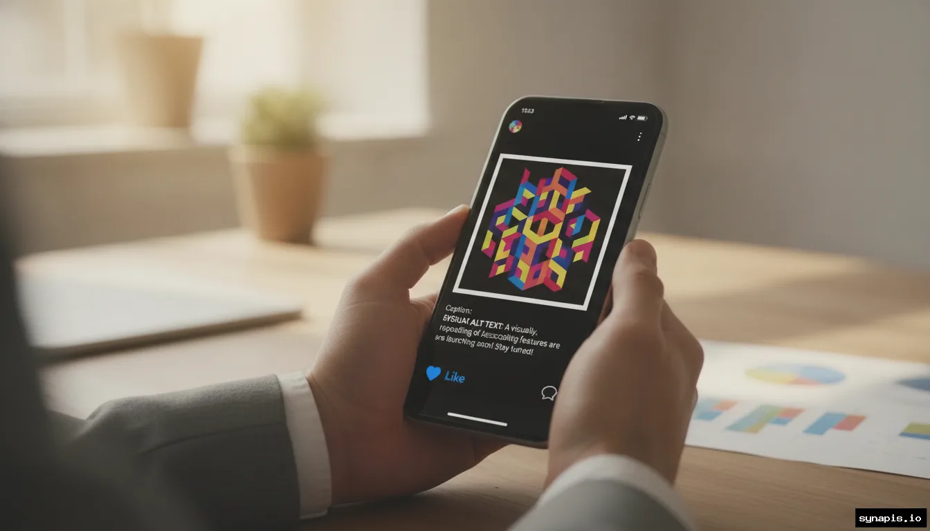
Every image requires meaningful alt text. Aim for concise, descriptive phrases that communicate the core idea, not just “image of product.” For example, “Red wool sweater with ribbed cuffs on hanger.” Videos need accurate captions, use tools to auto-generate, then edit for clarity. Include descriptions for important sounds or actions that aren’t obvious from the audio.
Plain language works best. Short sentences and familiar words help everyone, not just those with cognitive disabilities. When sharing links, make anchor text descriptive, like “download the full report” instead of “click here.” Thoughtful language and clear labeling create a smoother experience for all users.
Accessibility Features on Major Social Platforms
Facebook, Instagram, and LinkedIn each offer built-in accessibility tools. Facebook supports custom alt text for images and auto-generated captions for videos. Instagram allows manual alt text input and prompts for adding captions to Stories and Reels. LinkedIn provides alt text options and encourages descriptive post copy.
Stay up-to-date on platform updates. Social platforms regularly expand accessibility features, be sure to check each network’s guidelines for current best practices and feature rollouts. Building accessible posts natively within the platform maximizes compatibility with users’ assistive technologies.
Tools That Make Accessibility Easier
A range of free and paid tools streamline the process. Color contrast checkers, screen reader emulators, and auto-captioning services save time and catch errors you might miss. Automation platforms like Synapis help maintain consistency in voice and style, ensuring that generated captions and images follow your established guidelines for accessibility. Template-driven workflows can lock in accessible fonts, colors, and layouts, reducing manual effort for each post.
When evaluating tools, focus on their core strengths. Some tools highlight missing alt text or flag color contrast issues, while others assist with plain language checks or video captioning. Choose those that plug the biggest gaps in your current workflow and align with your preferred platforms.

Accessible Hashtags, Emojis, and Links
Hashtags should always be in CamelCase. This means capitalizing the first letter of each word for better readability by screen readers and humans alike, for example, #DigitalInclusion instead of #digitalinclusion. Place hashtags at the end of your post to avoid interrupting the main message.
Use emojis sparingly and only after the main message. Screen readers will read every emoji aloud, which can interrupt the user experience if overused. For links, use descriptive anchor text so users know what to expect. Never paste raw URLs in post bodies, always wrap them in meaningful phrases that set clear expectations.
Testing and Auditing Your Social Content for Accessibility
Regular testing helps catch issues before they reach your audience. Use screen readers to preview your posts, and leverage contrast checkers to verify color choices. Most platforms offer preview modes, but external tools provide a more accurate simulation of the user experience for people with disabilities.
Schedule monthly accessibility audits. Review a sample of recent posts for compliance: are all videos captioned, all images described, and all links informative? Consider feedback from users with disabilities, many brands have improved engagement by acting on direct suggestions from affected users.
Practical Accessibility Checklist for Marketers
The following table summarizes core checks every marketer should follow before publishing social media content. Adopting even a handful of these steps increases inclusivity and reach.
| Accessibility Step | Purpose | How to Check |
|---|---|---|
| Alt text for images | Ensures images are meaningful to screen reader users | Preview post with a screen reader |
| Video captions | Makes spoken content accessible to deaf users | Enable and review auto-captions for accuracy |
| High color contrast | Improves legibility for low vision users | Test with a contrast checker tool |
| CamelCase hashtags | Improves clarity for screen readers | Review hashtags for correct capitalization |
| Plain language | Makes content easier to understand for everyone | Check for jargon and lengthy sentences |
| Descriptive links | Clarifies destination for all users | Read anchor text out loud, does it describe the page? |
Looking Ahead: Building Lasting Accessible Practices
Consistent accessibility practices are the best way to ensure your content reaches and resonates with everyone. As social platforms evolve and user expectations climb, accessibility shifts from a checklist to a core part of brand strategy. Invest time in learning new tools and guidelines, and encourage your team to make accessibility part of every campaign, not just an afterthought.
Accessible social media content opens doors you might never have realized were closed. The reward isn’t just a larger audience, but deeper connections and a more trusted brand.